
In 1854, an English physician named John Snow mapped cholera deaths during an epidemic. While authorities blamed “bad air”, Snow plotted each death on a map. The pattern revealed that deaths clustered around a single water pump on Broad Street. By removing the pump handle, he ended the outbreak.
Snow’s insight was about seeing what others couldn’t see.
Most solopreneurs build websites the way Victorian authorities fought cholera. They focus on symptoms instead of causes. They add more features when visitors don’t convert. They blame their message when the real problem is structure. They optimize for search engines instead of human behaviour.
I built my first website 3 years ago. I was running an edtech organization called Brilliant Redemption Technologies, and like many entrepreneurs, I needed a website but had zero budget for professional development.
So I did what countless business owners do: I rolled up my sleeves, opened WordPress, and figured it out myself.
That first website was… let’s call it “functional.” It had all the elements I thought a business website needed: multiple pages, a contact form, some stock photos, and enough text to fill the space.
I would have shared the website for you to see but unfortunately it no longer exists because I failed to turn the business into a success.
Looking back, it was probably overcomplicated and definitely overwhelming for visitors, but it served its purpose and gave me my first taste of what it felt like to bring an idea to life on the web.
Last year, I got paid for the first time. For building a website for Dr. Nick Potkalitsky, an edtech consultant and author of the Educating AI newsletter(Subscribe to his newsletter if you’re into education and AI). Since then, I’ve built other websites. I’ve seen what works, what breaks, and what makes people say, “This finally feels like me.”
Three years might not sound like much. But experience isn’t always measured in time. It’s measured in iterations. In the reps you put in. In the brutal feedback you collect. And in how many times you scrap the pretty idea to serve the real need.
Three years may not rival the decades some developers boast, but it’s enough to carve out wisdom worth sharing.
So here are the 3 most important lessons I’ve learned from building websites… lessons I wish every solopreneur knew before they hit “publish.”
1. User Experience is Everything
When I built that first website for Brilliant Redemption Technologies, I was designing for myself. I knew where everything was supposed to be because I’d put it there.
I understood the navigation because it made sense in my head. I could find the information I needed because I’d written it.
This is the classic trap that many business owners fall into – building a website that works for them, not for their users.
Good user experience means your grandmother should be able to find what she’s looking for on your website within three clicks.
It means your contact form should work perfectly on a smartphone. It means your loading speed shouldn’t test your visitors’ patience while they wait for your hero image to appear.
We’re terrible at predicting how others will think. We project our own mental models onto other people. It’s called the “typical mind fallacy.”
When solopreneurs build their own websites, they commit this fallacy at scale. They assume their prospects think like they do. They don’t.
Your prospects aren’t thinking about your methodology. They’re thinking about their problem. They don’t care about your certifications. They care about their transformation. They don’t want to understand your process. They want to trust it will work.
Stop designing for yourself. Start designing for someone who’s never met you, doesn’t understand your jargon, and will leave in seconds if confused.
Your website’s job isn’t to explain everything you do. It’s to inspire one specific action. Every element that doesn’t serve that action is working against you.
2. Simplicity Scales Better
Every field has its illusion. In fitness, it’s fancy equipment. In investing, it’s complex strategies. In web design, it’s complexity.
Complexity is tempting, especially when you’re building your own website. Every new plugin or feature feels like you’re adding value, but often you’re just adding confusion.
The more elements you have, the more things can break, the harder it becomes to maintain, and the more overwhelming it is for visitors.
Simplicity, on the other hand, scales beautifully. A simple website is easier to navigate, faster to load, simpler to maintain, and more likely to guide visitors toward the actions you want them to take.
It’s also more forgiving of your design limitations – clean and simple can look professional even if you’re not a graphic designer.
This doesn’t mean your website has to be boring or generic. It means being intentional about what you include and why. Every element should have a purpose.
Every page should have a clear objective. Every feature should serve your users’ needs, not just showcase what’s technically possible.
When working on subsequent projects, I started with the question: “What’s the minimum this website needs to achieve its goal?” Then I built that. Only after the core functionality was solid and working did I consider what else might be genuinely helpful.
Most of the time, the simple version was already more effective than my original complex vision.
Cluttered websites create visual stress. Clean websites create visual calm. Calm people make better decisions. Better decisions mean more conversions.
3. Content is King, but Consistency is Queen
You’ve probably heard “content is king” a thousand times, and it’s true – good content is what makes websites valuable to visitors and visible to search engines. But it took me three years to fully understand that consistency is what makes content work.
The most beautiful website in the world won’t help your business if visitors can’t understand what you offer or why they should choose you.
Your content needs to clearly communicate your value proposition, but more importantly, it needs to do so consistently across every page, every section, and every interaction.
I see too many solopreneurs launch websites with amazing home pages but neglect their about pages, contact pages, and service descriptions. The result is a disjointed experience that erodes trust and confuses potential clients.
Consistency means using the same tone of voice throughout your website. It means your messaging aligns with your brand values on every page.
It means your contact information is accurate and up-to-date everywhere it appears. It means your brand colours and fonts create a cohesive visual experience.
Content builds authority. Consistency builds relationship.
Content is what attracts visitors, but consistency is what converts them into clients. It builds trust, demonstrates professionalism, and makes your business memorable in a crowded marketplace.
In a Nutshell
These three years of building websites have taught me that success isn’t about technical prowess or design awards – it’s about creating digital spaces that serve real people with real needs.
The web development journey never really ends. Technologies change, design trends evolve, and user expectations shift. But these foundational principles – putting users first, keeping things simple, and staying consistent – remain constant.
They’ve guided me from that first WordPress experiment to paid client work, and they’ll continue to shape how I approach every project going forward.
If you’re just starting this journey, remember that every expert was once a beginner. That first website doesn’t have to be perfect – it just has to be a start.
The lessons will come with experience, and each project will teach you something new about what works and what doesn’t.
The most important step is the first one. Everything else is just iteration.
Thanks for reading Sitecraft! Subscribe for free to receive new posts and support my work.
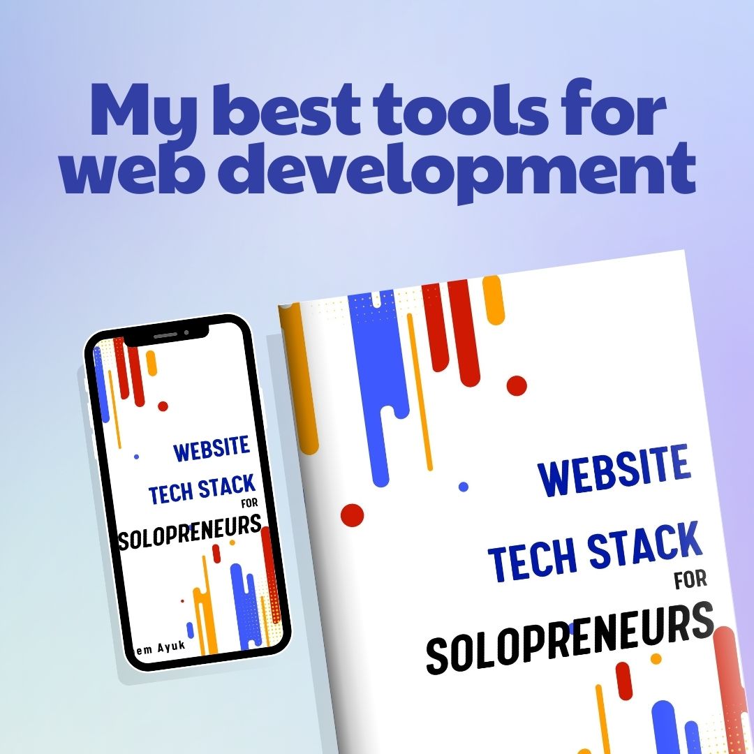
Visit my store to get valuable resources on everything you need to know about websites as a solopreneur.
I help coaches and consultants get premium clients by building websites that perfectly reflect their brand, showcase their expertise, and demonstrate the transformation they bring.
If you want such a website, just click the link below, choose your package, fill out a short form, and I’ll get to work. I only take 2 clients per month, so hurry.