Discover how the biggest solopreneurs convert premium clients.
I’m often fascinated by how casinos design their environments.
Like how there are no clocks on the walls… and how the lighting creates this perpetual golden hour that makes everyone look better than they do in real life.
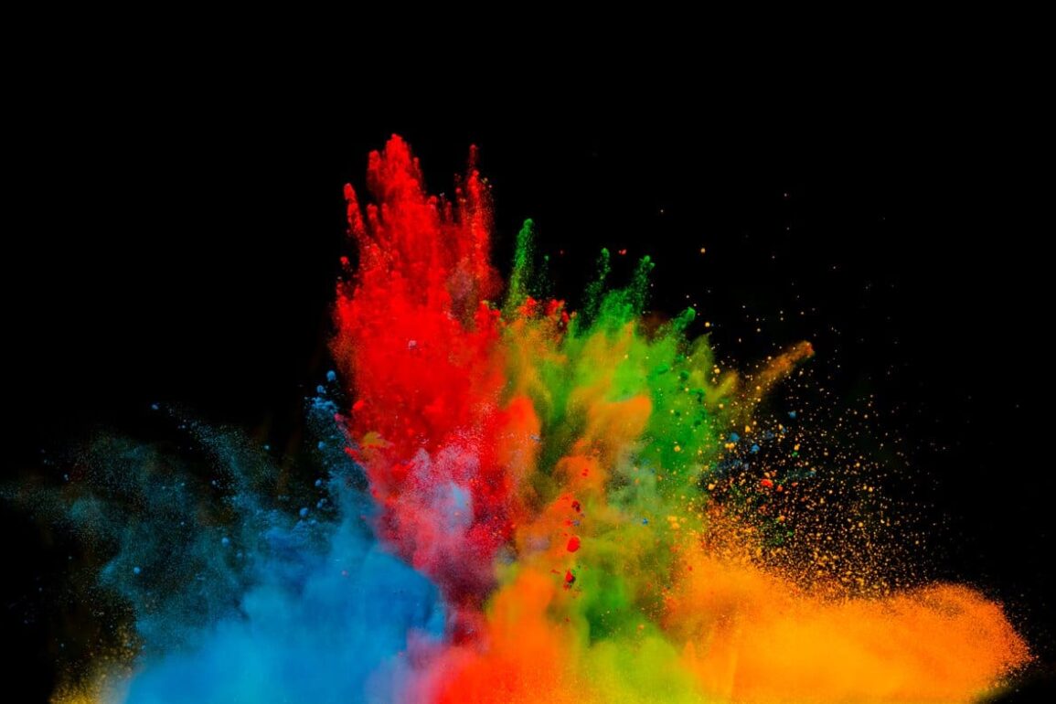
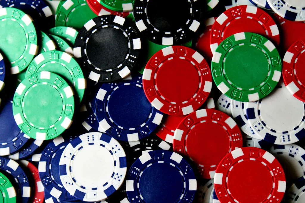
But most interesting is their strategic use of colour.
Red chips are worth more than blue ones. Red makes people bet more aggressively. Blue encourages more thoughtful, conservative play. None of this is accidental.
The casino designers know exactly what they’re doing. They understand that humans react to colour before we’re even conscious of seeing it.
Your website colour scheme wields this same transformative power.
It’s a psychological trigger that’s either working for you or against you right now with every premium client who lands on your page.
Let’s talk about what your colours are secretly telling your visitors and how to make them work strategically for your coaching or consulting business.
The 90-Second Rule of Colour Psychology
The human brain makes a subconscious judgment about an environment within 90 seconds of initial viewing.
And between 62% and 90% of that assessment is based on colour alone. That’s not my opinion. That’s research from the Colour Research Society.
Think about that.
Your expertise, your testimonials, your methodology… none of that matters if your colour choices have already sabotaged you.
Because colour isn’t processed like other information. It bypasses rational thought. It speaks directly to the limbic brain, our emotional centre, triggering instant associations and feelings that your visitors can’t articulate but absolutely feel.
Premium clients have particularly refined colour associations. Their brains have been conditioned by repeated exposure to high-end environments.
Luxury hotels. First-class lounges. Premium retail experiences. All using specific colour psychology to signal exclusive value.
Your website either activates these associations or contradicts them in the first moments of interaction. There is no neutral ground with colour psychology.
What Your Colours Are Really Saying
Every colour broadcasts specific psychological messages to your visitors. Here are the most strategic colours for converting premium coaching and consulting clients:
Deep Blue (#1E3A8A): Signals intelligence, stability, and depth of expertise. Blue increases perceived trustworthiness compared to other colours. But not just any blue. This specific deep shade outperforms navy (#000080) with premium clients. Perfect for business strategists and executive coaches.
Rich Burgundy (#800020): Communicates established authority and heritage. RB increases perceived value over standard reds for premium services. It signals tradition, wisdom, and refined expertise. Ideal for consultants with high-touch, relationship-based services.
Forest Green (#014421): Triggers associations with growth, wealth, and sustainable development. This shade improves premium tier selection compared to brighter greens. Especially effective for financial coaches and wealth advisors.
Charcoal Grey (#36454F): Projects sophisticated competence and analytical precision. It outperforms both black and standard grey for premium positioning. Essential for consultants offering data-driven or technical solutions.
Muted Gold (#D4AF37): Creates immediate associations with exclusivity and premium value.
What’s silently killing your premium conversions? Bright primary colours. Fire engine red (#FF0000). Electric blue (#0000FF). Canary yellow (#FFFF00). These scream “mass market” to sophisticated clients. They trigger price sensitivity rather than value appreciation. Every time I see a coach using these colours, I know they’re unintentionally positioning themselves as a commodity.
The Three Zones Where Colour Changes Everything
Not all website areas have equal psychological impact. Three specific zones determine whether premium clients stay or bounce:
1. The Trust Gateway
Humans almost always rely on first impressions.
We’re less likely to end up dating someone if our first encounter didn’t go well. We’re less likely to read an article till the end if the first line doesn’t intrigue us enough.
First impressions are trust gateways… and on your website, your trust gateway is your header.
It’s where visitors decide if you’re worth exploring further. Use sophisticated blues (#234E70) or understated neutrals (#F5F5F5) with subtle gold accents (#BFA26E) to establish immediate premium positioning.
2. The Value Threshold
Your hero section must trigger value perceptions before visitors process your content. The mathematics of colour here is non-negotiable:
- 60% primary brand colour (your dominant psychological trigger)
- 30% complementary colour (supporting the primary response)
- 10% strategic accent (drawing attention to conversion elements)
This isn’t arbitrary. It’s how the brain processes visual hierarchy.
3. The Decision Catalyst
Your call-to-action buttons represent the critical moment of psychological decision. The most effective colours for premium client conversion:
- Deep blue (#1A365D) for trust-based decisions
- Forest green (#1B512D) for growth-focused offers
- Burgundy (#8C1C13) for exclusive opportunities
The Dynamic Colour Experience
Premium clients are not just responding to individual colours. They’re processing the mathematical relationships between them.
They demand sophistication in every interaction. Their expectations extend beyond static colour placement.
Your colour harmony strategy is sending powerful subconscious signals about how sophisticated your thinking is.
The most effective websites use dynamic colour psychology throughout the user experience:
- Psychological Progression: Use colour intensity shifts of your primary colour (#1C3144 to #2D5172) to create intuitive information hierarchies.
- Colour-Triggered Satisfaction: Brief colour transitions on hover states (#496A81 to #5C7D95) create subliminal reward responses that keep premium clients engaged.
- Conversion Colour Mapping: Strategic colour shifts between different sections of your site create psychological momentum toward conversion.
What You Can Do Right Now
Here’s your 3-step process to implement strategic colour psychology on your website:
1. Premium Client Profiling: Identify which colour responses align with your ideal client’s psychological profile. Are they more responsive to trust triggers (blues), transformation signals (purples), or exclusivity markers (burgundies)?
2. Competition Colour Analysis: Map competitor colour strategies, then purposefully differentiate. If everyone in your niche uses the same blue (#0073e6), shift to a more sophisticated navy (#002855) to signal premium positioning.
3. WordPress Technical Implementation
- Configure custom colour palettes in your Gutenberg editor
- Use CSS variables for systematic colour application
- Implement colour consistency through child theme customization
- Set up dynamic colour states for interactive elements
After making these subtle tweaks, track how they impact key metrics like:
- Time on page
- Scroll depth
- Consultation bookings
- Scroll depth
- Consultation bookingsSubscribed
In a Nutshell
Every colour choice on your website either aligns with or contradicts the wealth psychology of your ideal clients. There are no neutral choices.
The gap between strategic colour implementation and random selection represents one of the highest ROI opportunities in your entire marketing ecosystem.
Is your colour strategy deliberately triggering premium associations, or accidentally signalling commodity value?
Your next $10,000 client will make judgments about your value before reading a single word of your content. What wealth signals are your colours transmitting?
Thanks for reading Sitecraft! Subscribe for free to receive new posts and support my work.
Visit my store to get valuable resources on everything you need to know about websites as a solopreneur.
I help solopreneurs 3x their income on autopilot through high-converting websites that use strategic colour psychology to position them at the top of their market. If you’re a solopreneur who wants more sales & premium clients without the stress, get a website that does it for you.